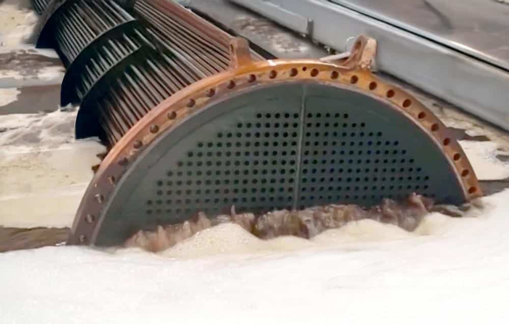
This is, without a doubt, the most important launch of our company and probably of the ultrasonic cleaning sector in recent decades. A&J Tecno Innovacions has created Brio Ultrasonics, the new brand of ultrasonic cleaning equipment with which we face a stage marked by our international expansion. Since its inception, the company A&J Tecno Innovacions S.L. has been dedicated to the design and manufacture of ultrasonic cleaning machinery. Internally, we decided that the existence of such a specialized business division required the creation of a differentiating brand that would cover a more specific market segment. This is what Alejandro Cubel, general manager of Brio, believes: “The company A&J Tecno has always been a benchmark in the ultrasound sector, but the market and the company itself have evolved and have been completely transformed during these 9 years. That is what has motivated the launch of the brand.”
“The A&J Tecno ultrasound division has been a benchmark in the sector, but the market and the company itself have evolved”
In addition, from the market perspective, there are three major trends according to Alejandro. “Firstly, the market demands simplification, proximity and agility, with technological innovation and digitalisation as the driving forces behind new business models. Secondly, the weight of the international market and globalisation. And thirdly, there is a transformation in the production model of industries, which is moving towards efficiency, acceleration of processes and improved energy efficiency.” So, we were clear: we needed a new brand that would be linked only to the ultrasonic cleaning sector, a brand that would accompany the company’s transformation and expansion process and that would evolve at the same pace as the business. Changes are not always easy The background to the launch of the new brand was not easy, as an internal source from the company recounts: “There was resistance to the change of brand. We were afraid that with the launch we would lose the recognition that our company had achieved in recent years, and that it would generate confusion among our customers. But the truth is that we always had trouble writing and spelling A&J, and the orange colour of our business group was not correctly associated with the idea of cleaning.”
“We chose Brio Ultrasonics because it was the name that best represented what we wanted to be and where we wanted to go.”
Anecdotes aside, the truth is that the search for the new brand has been done in record time: “The minimum period for launching a brand is about eight months, we have achieved it in two. We explored quite a few names that had an association with the ultrasound sector and that were linked to the values and attributes that we wanted to convey as a brand of cleaning equipment for the industry.” Thus, “we tested the names globally, analysing the association with the sector, its degree of differentiation, the attributes they conveyed and the ease of pronunciation, and we also analysed their viability for registration (of trademark, domains and social networks). It was also important to take into account its meaning and pronunciation in various languages.” Finally, the decision came: “We selected Brio because it was the name that best represented what we wanted to be and where we wanted to go.”.
This is the new A&J Tecno brand – BRIO Ultrasonics
The name For Alejandro Cubel, “the Brio brand is modern, global and representative of the design of our equipment: it evokes speed, efficiency and cleaning power. It is brief and is prepared to adapt to a new context and allows us to strengthen our relationship with all our stakeholders. The rebranding helps us convey a global company image and discourse, building credibility, both inside and outside Spain.”
The Logo The brand is made up of the word Brio and the symbol of an ultrasound wave, the most identifying and representative graphic element; the action of ultrasonic technology for cleaning. The aim was to create a compact and robust brand that would evoke technology and solidity. The rounded shapes are reminiscent of ultrasound waves.
Corporate colors Blues and greens are fundamental in the development of the visual identity. Blue and green tones are associated with technology, cleanliness and ecology; blue provides sobriety, cleanliness, professionalism and experience, and the white of the backgrounds helps to convey the idea of cleanliness and clarity, leaving “clean” spaces in which the corporate colors can be combined.
Typography The design team made the right choice by choosing the Weissenhof Grotesk typeface for the brand. It is a dynamic and friendly typeface where curves take on great importance, providing rhythm and fluidity. On the one hand, Brio’s corporate typeface is rounded, which reinforces the concept of waves and provides uniformity to the identity. On the other hand, it is geometric, technical and clean, and it is well associated with the brand.